미디어 쿼리(Media Query)
반응형 웹 디자인 요소로서 웹 화면의 콘텐츠가 디바이스마다 적절한 스타일로 보여질 수 있게 설정하는 기능이다.
모바일, 태블릿, PC 환경에 따라 화면 크기가 달라지므로 웹 사이트를 구상할 시 미디어 쿼리 기능을 설정해 주는 것이 좋다.
화면 크기에 따라 배경색이 달라지는 예제 코드를 연습해 보자.
/* CSS */
/* PC 스타일 */
@media screen and (min-width: 1025px) {
body { background-color: deepskyblue; }
}
/* 태블릿 스타일 */
@media (min-width: 768px) and (max-width: 1024px) {
body { background-color: gold; }
}
/* 휴대폰 스타일 */
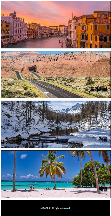
@media (max-width: 767px) {
body { background-color: plum; }
}
미디어 쿼리 기능을 사용하여 모바일, 태블릿, PC 화면에 맞는 반응형 레이아웃을 설정해 보자.
#container { width: 100%; }
header { width: 100%; }
header>h1 {
    text-align: center;
    font-size: 40px;
}

#menus { width: 100%; }
#menus>div {
    height: 300px;
    border: 1px solid black;
    margin-bottom: 15px;
    position: relative;
}
#menus h2 {
    position: absolute;
    font-size: 30px;
    right: 3%;
    bottom: 10px;
    text-shadow: 3px 3px 5px black;
}

#menu1, #menu2, #menu3, #menu4, #menu5 { width: 100%; }
#menu1 { background: url(../images/travel\(1\).jpg) no-repeat center/cover; }
#menu2 { background: url(../images/travel\(2\).jpg) no-repeat center/cover; }
#menu3 { background: url(../images/travel\(3\).jpg) no-repeat center/cover; }
#menu4 { background: url(../images/travel\(4\).jpg) no-repeat center/cover; }
#menu5 { background: url(../images/travel\(5\).jpg) no-repeat center/cover; }

footer {
    width: 100%;
    background-color: black;
    height: 100px;
}

footer>p {
    font-size: 14px;
    color: white;
    text-align: center;
    line-height: 100px;
}

/* 태블릿 스타일 */
@media  (min-width: 768px) and (max-width: 1024px) {
    #menus {
        display: flex;
        flex-wrap: wrap;
        justify-content: space-between;
    }

    #menu1, #menu2, #menu3, #menu4 { width: 49%; }

/* PC 스타일 */
@media screen and (min-width: 1025px) {
    #menus {
        display: flex;
        flex-wrap: wrap;
        justify-content: space-between;
    }

    #menu1, #menu2, #menu3, #menu4 { width: 32%; }

    #menu5 { width: 66%; }
<div id="container">
<header>
<h1>여행가자!</h1>
</header>
<section id="menus">
<div id="menu1">
<h2>경치</h2>
</div>
<div id="menu2">
<h2>노을</h2>
</div>
<div id="menu3">
<h2>드라이브</h2>
</div>
<div id="menu4">
<h2>겨울</h2>
</div>
<div id="menu5">
<h2>해변</h2>
</div>
</section>
<footer>
<p>ⓒ 2024. CI All rights reserved.</p>
</footer>
</div>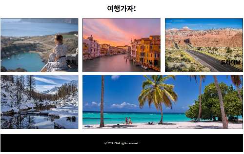
'웹 > html & css' 카테고리의 다른 글
| css 우선순위, 변수 (1) | 2024.11.05 |
|---|---|
| css 레이아웃 연습 (2단, 3단, 다단, flex) (0) | 2024.11.04 |
| css semantic tag, position, float (1) | 2024.11.04 |
| css form (0) | 2024.11.03 |
| css box model (0) | 2024.11.03 |


